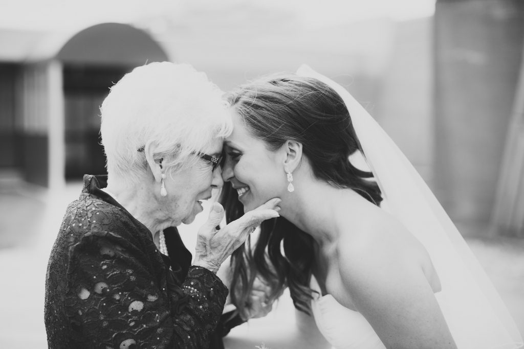
I’ve mentored quite a few photographers throughout the years, and I see the same questions + issues year after year:
“I’m not booking the type of couples I want to book.”
“I can’t convert leads.”
“I want to book couples that want candid photos, not posed ones. I seem to be attracting more traditional clients.”
Every one of these issues can easily be resolved by updating and improving your portfolio. It sounds simple, but it’s one of the most effective ways of growing your business. If you’re interested in a personalized review, I offer portfolio reviews as well as mentor sessions.
Here are my top five tips for improving your website + portfolio:
Order is Important
You are being judged within the first five images that you show on your site. Your first five images should be the best of the best. They should represent your brand, your style, your aesthetic, your approach, the way you use light, and your ideal type of client. They should stand out from the masses. It’s a lot of pressure, yes, but if you can nail it, you can convert someone that is jumping from site to site to someone that wants to linger a little longer.
Within these first seconds of viewing your site, this stranger(s) is subconsciously judging you. No matter what other images they might see, they’re going to build a profile instantly, and they’re going to decide whether they love you or hate you. It’s the way that we analyze the world around us, and we don’t really have any control over this. Malcom Gladwell’s book, Blink, is a great read into the psychology of choice/judgement, if you want to venture further down that path.

If You Try To Attract Everyone, You’ll Attract No One.
Further on the previous point, your images + branding should be aligned with the ideal type of client you want to attract. People want to see themselves in your images. Your blog posts, portfolio, words, color choices, voice all should align and communicate this clearly. Don’t be afraid to make this distinction clear as day. If you try to attract the masses, you will fall away with the masses. If you hate photographing details and would rather focus on moments, don’t share detail photos or posed images. This choice will speak for itself.
Show off what makes you special. I don’t only mean your images but also your personality. Your about page should be personal and speak beyond the “I picked up a camera when I was five…” Your about page should make people love you or dislike you. You WANT this separation. Scream to the people that you want to attract. Repel those that are not going to be a good fit. Spend a lot of time crafting your statement. Tell people why you do what you do. They will be more attracted to your why than your what.

Polish and Perfect
Your portfolio images should be perfect, flawless. Take out any distracting signs, power lines, double chins, blemishes, weird shapes on the edge of your frame. Watch your background. If it’s not working for you, then don’t use the image. Make sure the background compliments your subject.

All Killer No Filler
I heard this from Samm Blake at a conference a few years ago, and it has stuck with me ever since. Take out duplicitous images. Each photo in your portfolio should say something different about your work. Don’t stuff your portfolio with mediocre images to make it longer. Less is More.
The sum of your work will equate to your weakest images. Make sure there aren’t any. If your site only loaded one of your portfolio images, would it be strong enough on its own for the client to hire you?
You don’t need to share an image from every aspect of a wedding day either. I see so many photographers do this. They add in a staged group formal or not-so-great reception photo just to show that they can. In turn, it brings down the quality of their work. Your couples are not going to hire you for this. They want to feel connected to your work. It should be obvious from the images you share that you are capable of shooting a wedding…without showing the entire day. You can always send them a full gallery if you want to show off a full wedding.

Consistency, Consistency, Consistency
Make sure your lighting and editing is consistent throughout your website.
Make sure your lighting and editing is consistent throughout your website.
Make sure your lighting and editing is consistent throughout your website.
Do I need to say it again? :)
If you share inconsistent work, you lose trust with a potential client. They don’t know what they are going to receive from you. It also makes you look like a newb. If you update your portfolio and keep some old images, make sure to update them to match your current style of editing.